Imagine a world where data isn’t just numbers on a spreadsheet. It’s a vibrant, interactive canvas that tells a captivating story. That’s the power of Microsoft Power BI, the top business intelligence platform. It’s changing how organizations use data1.
Power BI has over 200 powerful functions for Data Analysis Expressions (DAX). This lets users find insights that were hidden before1. With monthly updates, this cloud service from Microsoft keeps growing to meet today’s data needs1.
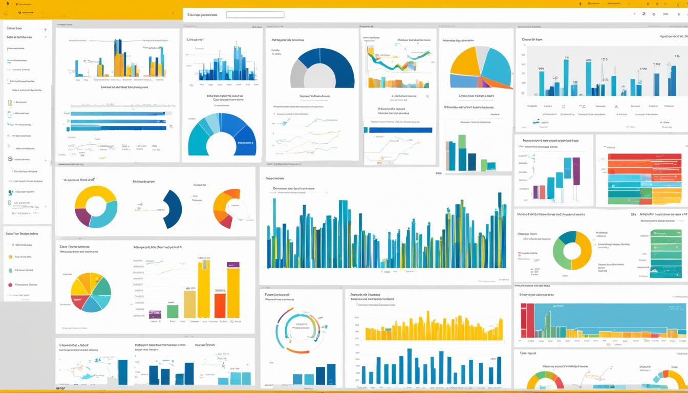
Power BI is more than a tool; it’s a game-changer in data visualization. It offers many visualization options, like stacked column charts and filled maps, to make your data interactive1. Plus, these dashboards are easy to use, needing no special skills1.
Key Takeaways
- Power BI offers over 200 powerful data analysis functions in its DAX library.
- The platform is continuously updated with new features and functionality.
- Power BI provides a wide range of data visualization options, including charts, maps, and more.
- Power BI dashboards are designed to be intuitive and user-friendly.
- Power BI integrates with a variety of data sources, both cloud-based and on-premises.
What is Microsoft Power BI?
Power BI as a Leading Business Intelligence Tool
Microsoft Power BI turns raw data into interactive, visually appealing insights2. It has a huge library of visuals, including many from AppSource, all tested by Microsoft2. This tool helps organizations make better decisions by bringing data to life with stunning visuals2.
Power BI includes Power BI Desktop, the Power BI service, and mobile apps for Windows, iOS, and Android2. It also has Power BI Report Builder for creating reports and Power BI Report Server for on-premises use2. People use Power BI for different tasks, like viewing reports or creating custom visuals2.
Creating a Power BI report starts with connecting to data sources, building a report, and publishing it online2. Microsoft Fabric helps with data analysis, and Power BI is a key part of it2. Paginated reports are great for printing or sharing, often used for things like invoices2.
Power BI Report Server lets you create and manage reports behind a firewall2. It’s flexible and can work with Power BI in the cloud, making it easy to switch to cloud solutions2.
Power BI makes complex data easy to understand and doesn’t require much analytics knowledge3. It has different pricing plans, so any company can use it without worrying about cost3. People use it to find insights, create charts, and make reports with real-time data3.
It’s popular among data analysts, BI pros, and others who need to make reports and forecasts3.
Power BI has many benefits, like being easy to use and integrate with other software3. But, it also has some downsides, like being expensive for some and having a complex interface3. It offers AI tools, hybrid deployment, quick insights, and more3.
Since 2011, Power BI has grown a lot, from Project Crescent to its current state3. It connects to data sources, offers reports and dashboards, and works with various data warehouses3.
Power BI includes many tools like Power BI Desktop and Power BI Pro4. Paid subscriptions give more analytics power4. It’s part of Microsoft’s Power Platform, which also includes Power Apps and Power Pages4. Even non-tech people can use Power BI to make reports and work with data4.
Analysts like data scientists and engineers use Power BI, along with many business users4. It’s used in many industries for data visualization and more4. If you’re looking for alternatives, consider Tableau or Domo4.
Bringing Data to Life with Interactive Visualizations
Microsoft Power BI makes data storytelling stick by linking it to facts. It shares insights with eye-catching visuals. By using visual perception, Power BI turns complex info into simple, interactive visuals5. This platform lets users bring in data from many sources, clean it, and shape it. They can then create dynamic models and apply advanced analytics5.
Power BI’s dashboards and reports make it easier to understand and remember information. This helps people make quick, informed decisions6. Adding a human touch to data through storytelling makes it more meaningful. Power BI’s wide range of visuals and the ability to make custom ones help users present complex data in an engaging way5.
“Data storytelling simplifies complex information for quicker and more confident decision-making. Effective data storytelling adds value to insights, interprets essential points, and provides a human touch to data.”6
Data storytelling in Power BI combines narrative, visuals, and data. This creates a story that grabs the audience and prompts action6. By using dashboards and visuals, users can understand metrics, predict trends, and spot key performance indicators. This unlocks valuable insights6.

Power BI is easy to use for both experts and beginners5. It offers sample chapters, code, and a forum for learning. This makes it simple to master the platform and use its features for interactive visualizations5.
| Benefit | Description |
|---|---|
| Increased Comprehension | Power BI’s interactive visualizations enhance audience understanding and retention of complex data6. |
| Faster Decision-Making | Intuitive dashboards and reports enable quicker, more confident decision-making based on data insights6. |
| Emotional Engagement | Data storytelling in Power BI adds a human touch, influencing decision-making by tapping into emotional context6. |
Power BI uses data visualization, interactive dashboards, and storytelling to change how we use and act on data. It empowers users to make better, more informed decisions6.
microsoft power bi: Exploring the Extensive Visual Library
Microsoft Power BI has a huge library of visuals, with hundreds more on the Microsoft AppSource platform. These visuals are tested and approved by Microsoft. They work well with Power BI, giving users many options to show their data7.
Power BI has everything from simple charts to complex visuals like decomposition trees and radial gauge charts7. Users can make great dashboards and reports with this big collection. Or, they can make their own visuals for their specific needs7.
Power BI also lets users use R script visuals for advanced data analysis7. The Q&A visual lets users ask questions in natural language and get answers with visuals7.
Microsoft keeps adding to Power BI’s visuals, thanks to the Power BI community7. This means users get more ways to show their data and find important insights7. This shows Power BI’s commitment to helping organizations make smart decisions and stand out8.
“Power BI’s visual library is truly remarkable, offering a diverse range of options to suit any data visualization need. The ability to create custom visuals further sets Power BI apart, allowing organizations to differentiate themselves and communicate their unique insights.”
As companies aim to use data more, showing data well is key9. Power BI’s big visual library helps users turn data into clear, useful insights. This leads to better decisions and success in business8.
Building Custom Visuals
Power BI’s vast library of visuals is great, but making your own can be even better for your business10. You can create visuals that fit your specific needs and industry11. This makes your organization stand out and lets you share your unique visuals with others or publish them online11. If you need help, you can find a Microsoft certified partner to design custom visuals for you10.
Customizing Visuals to Meet Specific Requirements
Power BI has many built-in visuals like line charts and maps10. But, you can take it further by making your own visuals with tools like jQuery and R-language scripts10. You can choose from Custom Visual Files, Organizational Visuals, and Marketplace Visuals to find the right one for you12.
Addend Analytics is a top Power BI partner that makes custom visuals for businesses10. They offer a wide range of visuals, from Waterfall Charts to KPIs, all tested for quality10. This ensures you get the most out of your data for better decision-making10.

The Microsoft AppSource has many custom Power BI visuals for you to pick from11. You can easily add these visuals to your reports to make your data more engaging12.
“Custom visuals in Power BI empower organizations to create unique and tailored visualizations that set them apart from the competition and drive data-driven decision-making.”
Power BI’s flexibility lets businesses unlock their data’s full potential11. This leads to better strategic decisions and outcomes11.
| Top 5 Custom Visuals in Power BI | Key Features |
|---|---|
| Advance Card | Conditional formatting, prefixes, postfixes, and extensive content formatting options |
| Animated Bar Graph | Visualizing trends over time, with Autoplay feature |
| Word Cloud | Displays word frequency and value visually |
| Infographic Designer | Customization of shapes, colors, and arrangement of charts |
| Inforiver | Creates complex financial statements without DAX or IT knowledge through formatting and styling options |
Custom visuals help organizations stand out and improve their data visualization11. Whether you work with a Power BI partner or make them yourself, the possibilities are endless101211.
Getting Expert Help with Data Visualization
For companies looking to make unique data visualizations, working with a Microsoft certified power bi partners is key. These pros have the skills to make data come alive with interactive dashboards and reports. They meet the company’s specific needs13.
Microsoft Power BI is great for making data visualizations, but sometimes you need custom power bi visuals. That’s where Power BI partners step in. They use their knowledge to create special solutions for the client’s data insights needs13.
These partners team up with companies to get to know their challenges and data needs. They work with the company’s team to make custom power bi visuals. These visuals improve how data is shown and help make better decisions13.
Working with a Power BI partner means getting access to lots of industry knowledge and best practices. These data visualization experts know how to solve specific problems in different sectors13.
Power BI partners also offer full support, from planning to maintenance. Their help ensures a quick return on investment and makes the most of Power BI13.
Whether it’s dashboards, custom visuals, or linking Power BI with other Microsoft tools, partners are key. By working with these experts, companies can turn data into useful data insights. This helps them use Microsoft Power BI to the fullest and improve their data visualization skills13.
“Power BI partners can be instrumental in helping organizations unlock the full potential of their data and drive informed decision-making.”
Exploring the Different Types of Visualizations
Microsoft Power BI has many data visualization types, each for a specific purpose14. It lets users make reports and dashboards that make data come alive15.
Power BI offers everything from simple bar and line charts to complex visualizations like treemaps and scatter plots16. These tools help turn data into clear stories16. Data visualization is key in data science, helping businesses make smart choices with data insights15.
Area charts in Power BI are great for showing trends over time and comparing groups15. Bar charts are easy to use for comparing different categories15. Line charts are perfect for showing trends, whether over time or across different groups15.
For data with many levels, Power BI’s treemaps are a great choice16. They use rectangles to show different levels of the data hierarchy16. Users can dive into details like average selling area size and merchandise categories16.
Power BI goes beyond basic charts with tools like Gauge charts, Funnel charts, and Scatter charts14. These visuals help users understand their data better, leading to smarter decisions15.
With so many visualization options in Power BI, users can pick the best way to show their data14. Whether it’s looking at sales, tracking performance, or diving into complex data, Power BI makes it easy to create engaging dashboards15.
“Data visualization is the graphic representation of data. By using visual elements like charts, graphs, and maps, data visualization tools provide an accessible way to see and understand trends, outliers, and patterns in data.”
Enhancing Reports with Power Apps and Q&A Visuals
Microsoft Power BI lets users make reports more interactive by adding Power Apps and using the Q&A visual. This mix makes exploring data easier and more fun.
Integrating Power Apps and Natural Language Querying
Report designers can now add Power Apps to their reports17. This lets users interact with data in new ways. It makes the report experience better and gives a full view of the data.
The Q&A visual in Power BI also lets users ask questions in everyday English17. They can type their questions and get answers with visuals17.
Power BI’s Q&A helps users by suggesting questions as they type17. It also suggests visuals based on the question, making data easy to understand17.
Users can customize Q&A visuals to show data in many formats17. This lets them make reports fit their needs, helping them make better decisions.
Right now, Power BI’s Q&A works mainly in English, with a Spanish preview17. As Microsoft improves it, we can expect more languages and better accuracy.
“The integration of Power Apps and the Q&A visual in Power BI empowers users to explore data in a more intuitive and engaging way, unlocking new levels of insights and decision-making capabilities.”
Power BI reports get more interactive with Power Apps and Q&A visuals17. This helps users explore data better and makes reports more engaging17. It helps businesses make better decisions and stay ahead in the market17.
Advanced Analytics with R Script Visuals
Power BI is a powerful tool that lets users use the R programming language for advanced analytics18. This feature, called R visuals, helps create dynamic and insightful visuals. It goes beyond what Power BI normally offers, opening up a world of complex data analysis and predictive modeling.
The R language has over 7,000 add-on packages18, making it great for complex data challenges. Power BI makes it easy to use this power, letting you add custom R visuals to your reports and dashboards19. You can make these visuals in Power BI Desktop and share them on the Power BI service. This way, you get to use R’s advanced analysis with Power BI’s easy data visualization and reporting.
Not all R packages work in the Power BI service18, but there are many approved ones you can use. These visuals work just like any other in Power BI18. You can filter, cross-filter, and pin them to dashboards for a smooth fit with your reports19.
R visuals in Power BI are great for showing complex data in a clear way. They’re perfect for advanced analytics like forecasting, predictive modeling, and data mining, adding depth to your Power BI reports.18 But remember, only Pro users with domain verification can use R visuals in the Power BI service19.
When using R visuals in Power BI, remember the limits and rules the platform has. For example, R visuals in Power BI Desktop can’t handle more than 150,000 data rows or 250 MB in size1820. Also, they’re shown at a fixed resolution and long calculations might cause a timeout error1820.
Despite these limits, R visuals in Power BI are incredibly powerful. With millions of R users and thousands of packages ready to use19, Power BI helps you uncover new data insights. This can greatly improve your business decisions. Using R visuals in Power BI can change the game in your analytics journey.
Adding R visuals to Power BI opens up a world of advanced analytics. It lets users tap into the rich capabilities of the R language within the easy-to-use Power BI platform.
Conclusion
Microsoft21 Power BI is a top tool for data visualization and business intelligence. It helps turn raw data into interactive dashboards. With many visual options22, it makes data easy to understand, helping users make better decisions23. It also works well with Excel and Microsoft Teams, and offers advanced analytics like R scripting.
Power BI is great for anyone in an organization wanting to use data more effectively21. It’s easy to use and helps people from different departments work better together22. It has mobile apps and connects well with Microsoft’s data tools, making it a key platform for making smart choices and improving businesses.
With help from Microsoft’s guides and models, like the adoption roadmap and maturity model23, companies can start using Power BI well21. Power BI has shown it’s a top choice for business intelligence. It helps companies use their data fully and stay ahead in the data-driven world.
FAQ
What is Microsoft Power BI?
Microsoft Power BI is a tool that turns raw data into interactive insights. It has a big library of visuals, including many from AppSource. These visuals work well with Power BI and give valuable insights.
How does Power BI help organizations make informed decisions?
Power BI uses data storytelling to share insights clearly. This makes it easier for people to understand and remember information. It turns complex topics into simple, interactive visuals.
What types of visualizations are available in Power BI?
Power BI has many visualization types, like area charts and pie charts. Each type is made to show different kinds of data. This lets users pick the best visual for their information.
How can users interact with Power BI reports?
Users can interact with Power BI reports through a Power App. They can also use the Q&A visual to ask questions in natural language. The Q&A visual then shows the right visualization for the question.
What advanced analytics capabilities does Power BI offer?
Power BI supports R script visuals for advanced analytics. These visuals can do things like forecasting. Users can create and share these visuals in Power BI Desktop and the Power BI service.
Source Links
- Data Visualization with Microsoft Power BI – Basics and Beyond – https://www.xenonstack.com/blog/data-visualization-with-power-bi
- What is Power BI? – Power BI – https://learn.microsoft.com/en-us/power-bi/fundamentals/power-bi-overview
- What is Microsoft Power BI? Uses, Features and More | Definition from TechTarget – https://www.techtarget.com/searchcontentmanagement/definition/Microsoft-Power-BI
- What Is Power BI? What It Is, How It’s Used, and More – https://www.coursera.org/articles/what-is-power-bi
- Applied Microsoft Power BI: Bring your data to life!: Lachev, Teo, Price, Edward, Lachev, Maya: 9781733046121: Amazon.com: Books – https://www.amazon.com/Applied-Microsoft-Power-BI-Bring/dp/1733046127
- What is Data Storytelling and Data Storytelling Examples | Microsoft Power BI – https://powerbi.microsoft.com/en-us/data-storytelling/
- Visualization types in Power BI – Power BI – https://learn.microsoft.com/en-us/power-bi/visuals/power-bi-visualization-types-for-reports-and-q-and-a
- What is Power BI?: Everything You Need to Know! – https://www.simplilearn.com/tutorials/power-bi-tutorial/what-is-power-bi
- The Good and the Bad of Microsoft Power BI Data Visualizatio – https://www.altexsoft.com/blog/power-bi-pros-cons/
- Microsoft Power BI Custom Visuals | Addend Analytics – https://addendanalytics.com/power-bi-custom-visual
- Top 5 Custom Visuals in Power BI – https://www.analyticsvidhya.com/blog/2022/09/top-5-custom-visuals-in-power-bi/
- Main sources for acquiring Power BI custom visuals – Power BI – https://learn.microsoft.com/en-us/power-bi/developer/visuals/power-bi-custom-visuals
- Power BI | Data Visualization from Microsoft | Rand Group – https://www.randgroup.com/microsoft/power-platform/power-bi/
- ▷ Power BI Visuals List & The Ultimate Toolkit for 2024. – https://mindmajix.com/power-bi-visualization-types
- The Ultimate Guide to Power BI Visualizations – https://www.analyticsvidhya.com/blog/2023/12/the-ultimate-guide-to-power-bi-visualizations/
- Killer Visualizations in Power BI – https://powerbi.microsoft.com/en-us/blog/killer-visualizations-in-power-bi/
- Explore and create visuals in your reports using Power BI Q&A – Power BI – https://learn.microsoft.com/en-us/power-bi/natural-language/power-bi-tutorial-q-and-a
- Create advanced analytics and visualizations using R scripts – Power BI – https://learn.microsoft.com/en-us/power-bi/visuals/service-r-visuals
- R for the masses with Power BI – https://powerbi.microsoft.com/en-us/blog/r-visuals-in-powerbi-service/
- Create Power BI visuals using R – Power BI – https://learn.microsoft.com/en-us/power-bi/create-reports/desktop-r-visuals
- Why Power BI is the Best Business Intelligence tool? – https://intellipaat.com/blog/power-bi-tool/
- Microsoft Power BI – KAMIND IT – https://www.kamind.com/microsoft-power-bi/
- Microsoft Fabric adoption roadmap conclusion – Power BI – https://learn.microsoft.com/en-us/power-bi/guidance/fabric-adoption-roadmap-conclusion