
Your cart is currently empty!
Mobile-Friendly Website Design: Boost Your Online Presence
In today’s world, mobile devices are the main way people get online. With 80% of internet users on smartphones and tablets, having a mobile-friendly website is key. It ensures a smooth online experience for everyone.
So, what makes a website mobile-friendly? And how does it help your online success? We’ll explore mobile-friendly design and share tips to make your website work well on mobile devices.
Key Takeaways
- The shift towards mobile internet usage is undeniable, with 80% of users accessing the web through mobile devices.
- Mobile-friendly website design is crucial for SEO, as it directly impacts a site’s visibility and ranking in search engine results.
- A mobile-friendly website can lead to increased lead generation opportunities, fostering trust and engagement with the brand.
- Optimizing for mobile devices can enhance user experience, reducing bounce rates and driving higher conversion rates.
- Responsive design and performance optimization are key strategies for creating a successful mobile-friendly website.
The Rise of Mobile Internet Usage
The internet has changed a lot, with over 1.7 billion websites but only 300 million updated regularly. This shows how mobile devices are now key for accessing the internet. People use smartphones and tablets more to look up things and connect with businesses, making it easier for everyone.
Mobile internet use has grown fast. Now, over 50% of all web traffic comes from mobile devices. People visit fewer types of sites on their phones than on computers. Also, more than half of all searches are done on mobiles, showing how crucial a mobile-friendly approach is online.
In the U.S., mobile devices are even more popular, with over 70% of digital time spent on them. Smartphones are used for 57% of this time, showing how big an impact mobile tech has on how we act and what businesses need to do to keep up.
Mobile-Friendly Websites: The New Norm
Now, having a website that works well on mobile is key. A mobile-friendly site makes sure users have a good experience, no matter the device. This makes it easy for customers to find and interact with a business online, on any device.
Google’s updates have made mobile-friendly sites more important. They now rank these sites higher in search results. So, businesses that focus on mobile get more visitors and potential customers.
Having a site that works well on mobile does more than just help with search rankings. It also lowers bounce rates, increases conversion rates, and boosts customer engagement. These things lead to more sales and a stronger online presence.
As mobile devices become more common, businesses must focus on mobile first. By optimizing for mobile, companies can stay ahead and grow in the digital world.
What is a Mobile-Friendly Website?
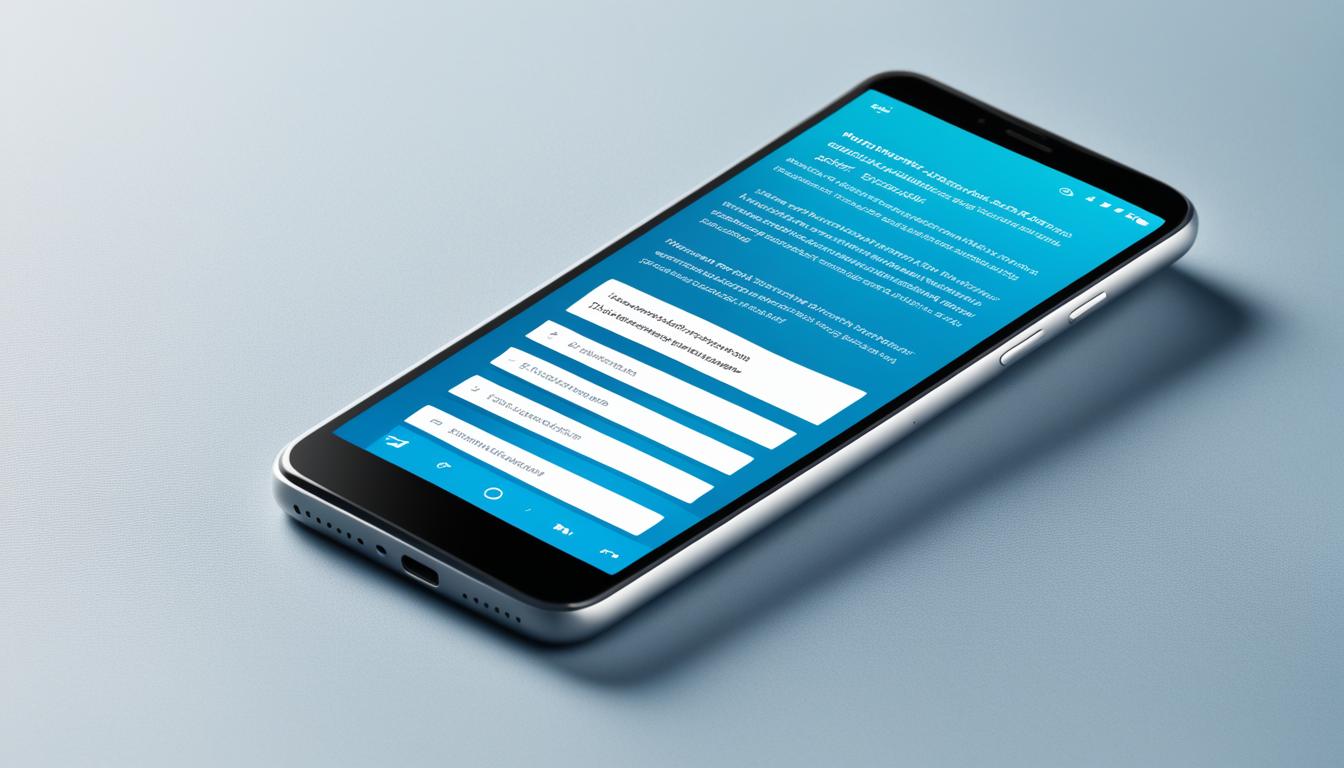
A mobile-friendly website works well on all devices, giving users a smooth experience everywhere. It has clear text, easy navigation, and links that are easy to click on any device. Fast loading, clear calls-to-action, and touch-friendly buttons are also key features.
What makes a website mobile-friendly has changed a lot over time. Before, websites had separate versions for mobile and desktop. Now, we focus on one site that works on all devices.
The Importance of Mobile-Friendly Design
More than 60% of internet use comes from mobile devices. So, having a mobile-friendly website is key for businesses. It offers big benefits:
- Improved user experience: Users find it easy to use your site on any device.
- Enhanced search engine optimization (SEO): Google likes mobile-friendly websites and ranks them higher.
- Increased lead generation and conversions: A smooth mobile experience means more engagement and fewer people leaving your site.
To make a site mobile-friendly, businesses use responsive or adaptive design. Responsive design changes the site’s layout based on the screen size. Adaptive design changes the layout for different devices.
The main aim is to make sure the website works well on all devices. This helps with online visibility, engagement, and business success.
Approaches to Creating a Mobile-Friendly Site
In today’s digital world, having a mobile-friendly website is essential. More people use smartphones and tablets to access the internet. Businesses must make sure their websites work well on these devices. There are three main ways to make a site mobile-friendly: responsive design, adaptive design, and separate mobile sites.
Responsive Design: A responsive website changes to fit the device you’re using. It makes sure the content looks good on any screen size. This means a smooth experience for users on desktops, tablets, and phones.
Adaptive Design: This method sends different HTML and CSS based on the device. It makes the website fit the device’s screen size and features. This approach gives a better experience by tailoring the site to each device.
Separate Mobile Website: Some businesses make a special mobile site on a subdomain like m.example.com. These sites are made just for mobile and are easy to use on small screens.
Choosing the right approach depends on your goals, tech skills, and resources. Responsive design is often best because it works on all devices and is easier to manage. But, adaptive design and separate mobile sites have their own benefits, like better performance or a unique mobile experience.
The main goal is to give users a great experience on your mobile site. Using a mobile-friendly design strategy can boost your online presence, engage users more, and lead to better results.
Benefits of a Mobile-Friendly Website Design
In today’s digital world, having a mobile-friendly website is key for businesses of all sizes. With more people using mobile devices to surf the web, a site that works well on smartphones and tablets is crucial. A mobile-friendly site opens up many chances to grow your online presence.
Increased Reach and Visibility
More web traffic comes from mobile devices now. A mobile-friendly site helps your business reach more people. It makes it easy for your target customers to find and connect with your brand, no matter the screen size.
Improved User Experience (UX)
A mobile-friendly site puts your mobile users first, offering an easy and intuitive interface. With bigger text, better navigation, and fast loading times, users enjoy their visit. This makes them more likely to stay on your site and take action.
Enhanced Search Engine Optimization (SEO)
Google now values mobile-friendliness in its search rankings. By making your site work well on mobile, you can boost your search engine ranking. This means more organic traffic and potential leads for your business.
Lead Generation Opportunities
A mobile-friendly site makes it easy for users to interact with your content and fill out forms. This leads to more leads as people can easily move through your site on any device.
Higher Conversions
When users have a good experience on a mobile site, they’re more likely to take action, like buying something or signing up for a newsletter. This can lead to more conversions, helping your business grow and make more money.
“As of April 21, 2015, Google started prioritizing mobile-optimized sites in mobile search results, making it crucial for businesses to ensure their websites are mobile-friendly.”
By using the benefits of a mobile-friendly design, you can set your business up for success online. You’ll see more reach, better user experience, and more conversions. The benefits of focusing on mobile are clear.
Increased Reach and Visibility
More people are using mobile devices to access the internet, making it key to have a website that works well on mobile. Today, over 58% of all web traffic comes from mobile devices. This trend is growing, offering businesses a big chance to reach more people and grow their online presence.
Optimizing your website for mobile means your content is easy to find and use on smartphones and tablets. This makes for a better user experience and helps you show up higher in mobile search results. Google’s “Mobilegeddon” update in 2015 made mobile-friendly sites more important, pushing businesses to focus on responsive design and mobile optimization to keep up their rankings.
Now, people use mobile devices more than ever to connect with brands. Most emails are opened on mobile, and many local searches for buying things start on smartphones. By making your website mobile-friendly, you can reach more people, engage with them more deeply, and increase sales.
| Metric | Percentage |
|---|---|
| Global mobile web traffic | 58.33% |
| Increase in mobile usage since 2015 | Steady around 50% |
| Smartphone ownership in advanced economies | Higher compared to emerging economies |
| Popular mobile screen sizes | 5.8 inches, 6.2 inches, 6.5 inches, 6.7 inches, 6.8 inches |
Choosing a mobile-friendly website opens up new ways to connect with your audience, increase brand awareness, and boost your online presence in a world where mobile is key.
Improved User Experience
In today’s mobile-first world, making your website easy to use is key to reaching your audience. It’s important to think about how people use their smartphones and design your site with that in mind.
Users look for an easy and natural experience. They don’t want to zoom in and out just to see your content. Small details can greatly improve how happy and engaged users are with your site.
Optimizing for Mobile UX
To make your site user-friendly, follow these tips:
- Make sure buttons and other things you can click are big and easy to find.
- Use intuitive navigation so users can quickly find what they need.
- Make your content and layout work well for seamless scrolling, so you don’t need to zoom a lot.
- Use responsive design to make sure your site looks good on all devices.
- Focus on fast loading times to keep users happy and reduce bounce rates.
By following these mobile UX tips, you can make a site that looks good on phones and works well for users. This means a better experience for everyone.
“Users expect the same user experience on mobile devices as they do on desktops and tablets.”
A smooth and easy mobile-friendly design can boost user engagement, increase conversions, and improve how people see your brand. With more people using mobile devices, focusing on a user-first design is smart for your business.
Enhanced Search Engine Optimization (SEO)
Having a mobile-friendly website does more than just make users happy. It’s key for your SEO too. Search engines like Google value mobile-friendly sites a lot. They use it as a big part of how they rank websites.
If your site doesn’t work well on all devices, you could lose search rankings. This makes it harder for people to find your business online. It makes your marketing harder.
Google now likes responsive websites a lot. They think mobile-friendliness is very important for SEO. In March 2020, Google upgraded its use of mobile-friendliness as a factor to improve search engine optimization (SEO) ranking. This means Google picks websites that work well on mobiles. They make sure your site is easy to use and fun on any device.
To make your site better for mobile SEO, focus on these things:
- Responsive design that changes for different screens
- Fast loading times for a smooth experience
- Easy navigation and organized content
- Optimized images and multimedia
- Smart use of keywords and meta tags
By working on these mobile SEO tips, you can make your site more visible online. This means more people can find and connect with your content. This leads to more traffic, more sales, and a stronger online presence for your business.
So, making your site mobile-friendly is not just for the users. It’s also key for search engines and your digital marketing strategy.
Lead Generation Opportunities
Generating leads is key to a strong inbound marketing plan. If you’re not drawing in new people who need what you offer, your marketing might not be working. A mobile-friendly website helps you create leads because people are always on their phones. This increases the chance they’ll interact with you and trust your brand. Plus, it makes it easy for potential clients to contact opportunities when they have your site on their phone.
Boosting lead generation can be done through A/B testing to make your website better for lead capture. Adding live chat on your site can also increase conversions and leads by offering a direct way for customers to talk to your business. Making your website mobile-friendly can also help you rank higher on search engines. This means more people can find your online presence.
Using SEO, like on-page optimization and content marketing, can greatly increase lead generation chances. Visual content, like videos and infographics, can grab attention and be more memorable. Chatbots can help get important info from potential leads. Reviews and testimonials can help build trust and credibility.
| Tactic | Impact on Lead Generation |
|---|---|
| A/B Testing | Helps optimize website versions for lead capture |
| Live Chat | Increases conversions and lead generation |
| Mobile Optimization | Improves search engine rankings |
| SEO Techniques | Boosts lead generation opportunities |
| Visual Content | Effective tools for capturing leads |
| Chatbots | Assists in collecting information from potential leads |
| Reviews and Testimonials | Aids in establishing credibility and generating trust |
Using these strategies can help you make the most of your lead generation efforts. Your mobile-friendly website can become a powerful tool for attracting and turning potential customers into valuable leads.
“The median user conversion rate for B2B websites was 2.5% in 2024. Ensuring a low bounce rate is crucial to retaining visitor engagement on websites.”
mobile-friendly website design
Nowadays, mobile devices are the main way we access the internet. So, having a mobile-friendly website is very important. A mobile-friendly website looks great and works well on small screens like smartphones and tablets. It makes sure the website content is easy to see and use on different mobile devices.
Mobile devices make up about 59% of all web traffic worldwide. By 2025, there will be 7.49 billion mobile device users globally. This shift to mobile use means search engines like Google now favor mobile-friendly websites. They rank these sites higher in search results.
Responsive web design is a key way to make websites mobile-friendly. It changes the website to fit different screen sizes and devices. This makes the website easier to use and can help it rank higher in search results. Mobile users like websites that are easy to read and navigate.
Key Considerations for Mobile-Friendly Website Design
- Optimize for fast loading times: Mobile users expect pages to load quickly, with a target of three seconds or less.
- Prioritize mobile-first design: Focus on the mobile experience first, then scale up to larger screens.
- Utilize responsive design principles: Ensure your website adapts seamlessly to various screen sizes and device orientations.
- Simplify the user interface: Minimize clutter, simplify navigation, and optimize for touch-based interactions.
- Enhance readability: Use larger font sizes, clear typography, and high-contrast color schemes for improved legibility on mobile.
- Avoid heavy graphics and animations: These can slow down page loading times and negatively impact the mobile user experience.
By making your website mobile-friendly, you can reach a huge audience and boost your online presence. This approach also ensures a better user experience, keeping customers happy and engaged. As mobile use grows, focusing on mobile design is key to staying competitive and relevant.

“A mobile-friendly website is no longer a luxury, but a necessity in today’s digital world.”
Low Bounce Rate and High Conversion
In the digital marketing world, the mobile bounce rate and conversion optimization are key. They show how well your website engages users. A low bounce rate and high conversion rates are what businesses aim for to boost their online presence and connect better with their audience.
The mobile bounce rate shows the percentage of users who leave your site after seeing just one page. A bounce rate over 50% means your site might not meet your mobile visitors’ needs. It’s a sign that your content might not be relevant or engaging enough.
A low bounce rate, under 40%, means your mobile site is doing well. It means people find what they need quickly and easily. This leads to them checking out more pages, engaging with your content, and converting into leads or customers.
Conversion optimization aims to get more visitors to take a desired action, like buying something or signing up for a newsletter. By making your website better in design, content, and flow, you can get more visitors to convert. This helps your business grow and succeed.
To get a low bounce rate and high conversion, focus on a mobile-friendly design, fast loading speeds, and engaging content. This approach boosts user engagement, conversion optimization, and lowers the mobile bounce rate.
“A mobile-friendly website is not just a luxury, but a necessity in today’s digital landscape. It’s the key to unlocking higher user engagement, lower bounce rates, and increased conversions – the trifecta of online success.”
| Metric | Ideal Range | Implications |
|---|---|---|
| Mobile Bounce Rate | Below 40% | Indicates a positive user experience and engagement on your mobile website. |
| Conversion Rate | Above 2% | Suggests that your website is effectively converting visitors into customers or leads. |
By focusing on these key metrics and using a mobile-first approach, you can build a strong online presence. This drives more traffic and helps you achieve your business goals.
Improved SEO Ranking
In today’s fast-changing digital world, having a website that works well on mobile is key for businesses to stay visible online and boost their SEO ranking. Google, the top search engine, now values mobile-friendly sites a lot. It rewards sites that give a great experience to users on all devices.
The Importance of Mobile SEO
More people use the internet on their phones, so Google has made mobile-friendly sites a big deal for search rankings. Recent reports show that Google sees mobile-friendliness as a key factor for SEO ranking. This means businesses with mobile-friendly sites are more likely to show up higher in search results. They reach more people and get more potential customers to their sites.
Google’s updates have a big effect on mobile SEO. Studies have found that sites that work well on mobile can see a big jump in their search rankings. This leads to more visibility and more people converting into customers. By making sites mobile-friendly, businesses can boost their SEO and give a smooth experience to their mobile users.
- Google likes responsive sites and sees mobile-friendliness as a way to improve SEO ranking.
- Mobile-friendly sites are more likely to show up higher in search results, reaching more people and getting more potential customers.
- Optimizing for mobile can lead to a big boost in search rankings and a better experience for mobile users.
In conclusion, mobile SEO is very important. Making sure your site is mobile-friendly and SEO-ready can increase your online visibility, reach more people, and help your business grow. Being ahead in mobile optimization is a smart move for success in today’s digital world.
Speedy Loading Time
In today’s fast world, how quickly a website loads is key to its success online. With more people using mobile internet, this is even more important. A slow-loading mobile site can make users leave quickly, which hurts your business.
Studies show over 80% of people are unhappy with mobile browsing. Also, 64% expect sites to load in 4 seconds or less. The average time is 9 seconds, showing the need for faster mobile sites.
Slow loading can come from many things like network issues, phone limits, and big websites. To fix this, use performance optimization methods. This includes making images smaller, reducing scripts, and cutting down on style sheets.
Focus on making your mobile site fast for a better user experience. This makes customers happier and can boost your search engine rank. Google likes sites that load quickly on mobile.
| Network Type | Average Download Speed | Recommended Website Size |
|---|---|---|
| 3G | 2 Mbps (US), 2.1 Mbps (UK) | 1 MB |
| 4G | 6.2 Mbps (US) | 3 MB |
Make your mobile site fast for a great user experience. This can set you apart, engage more customers, and increase sales. Remember, every second counts online, and your site’s speed can be the deciding factor.
“A mobile-friendly website that loads quickly can make all the difference in today’s competitive online landscape.”
Quality Landing Pages
In today’s digital world, a business’s success often depends on its mobile presence. With more people using mobile internet, having a site that works well on mobile is key. This means focusing on mobile landing pages that perform well.
Mobile landing pages are key to getting more clicks and conversions. They give mobile users a clean, focused experience. Studies show these pages can convert about 11.70% of visitors, much higher than those that aren’t optimized for mobile. This is because mobile users quickly lose interest, so a good landing page grabs their attention fast.
Creating great mobile landing page design is more than just fitting content on a small screen. It’s about making sure the message and content are clear and meet mobile users’ needs. This means using images wisely, placing call-to-action buttons well, and making sure the site works smoothly from start to finish.
Well-designed mobile landing pages have many benefits. They can lower bounce rates, boost SEO rankings, and increase leads and sales. By focusing on making your mobile landing pages better, you can reach more people and give them a positive experience.
| Metric | Impact on Mobile Landing Pages |
|---|---|
| Conversion Rates | Mobile landing pages help drive conversions and clicks because they provide a distraction-free experience tailored for mobile users, resulting in faster conversions and increased conversion rates. |
| Bounce Rates | Studies show that mobile users have a lower attention span compared to desktop users, leading to higher bounce rates if mobile landing pages do not capture visitors’ attention quickly. |
| Image Optimization | Faster load times on mobile landing pages are crucial for retaining visitors and preventing high bounce rates, emphasizing the importance of optimizing images for mobile devices. |
| Call-to-Action Placement | Having a single call to action on a mobile landing page is essential for maintaining a high attention ratio and guiding visitors towards conversion. |
| Design Impact | A simple and user-friendly design on mobile landing pages is key to ensuring ease of navigation for visitors, resulting in a smoother user experience and potentially higher conversion rates. |
Brands like Death Wish Coffee and Simply Chocolate show how important targeted messaging, streamlined content, and mobile-friendly design are. They drive user engagement and conversions. By learning from these leaders, businesses can make their mobile landing pages better and improve their online presence.
Conclusion
Creating a mobile-friendly website helps businesses boost their online presence optimization. It lets them reach more people, make the user experience better, and get higher SEO rankings. This is key as more people use the internet on their phones.
With a good digital marketing strategy, businesses can stay ahead. They can use the growing trend of mobile internet to grow and succeed over time.
Search engines give higher rankings to websites that work well on mobile. A mobile-friendly design means more pageviews, better user engagement, and more chances to turn visitors into customers. Speed and a smooth experience on mobile are very important.
Having a mobile-friendly website design helps with search engine rankings and makes the user experience better. It also makes it easier for people to find and use a business’s services. By offering a great mobile experience, businesses can grow their customer base and gain trust with their audience.
FAQ
What is a mobile-friendly website?
A mobile-friendly website works well on any device. It has easy-to-read text, simple navigation, and clickable links. This makes it great for handheld devices and tablets.
What are the main approaches to creating a mobile-friendly site?
You can make a mobile-friendly site in three ways: responsive design, adaptive design, or a separate mobile site. The choice depends on your goals and skills.
What are the benefits of having a mobile-friendly website?
A mobile-friendly website helps businesses grow online. It reaches more people, improves user experience, boosts SEO, and increases leads and conversions.
How does a mobile-friendly website impact SEO and search rankings?
Search engines like Google favor mobile-friendly sites. If your site isn’t ready for mobile, your SEO ranking will suffer. This makes it harder to be found online.
How can a mobile-friendly website improve lead generation?
A mobile-friendly site helps you connect with users on their devices. This increases the chance of them interacting with you and trusting your brand.
What are the characteristics of a well-designed mobile-friendly website?
A good mobile site loads fast, has clear calls-to-action, and touch-friendly buttons. It’s designed for how people use smartphones.
How does mobile-friendliness affect website bounce rate and conversions?
A well-made mobile site offers a better user experience. This lowers bounce rates and raises conversions. Bad design can push users away.
 Afrikaans
 Albanian
 Amharic
 Arabic
 Armenian
 Azerbaijani
 Basque
 Belarusian
 Bengali
 Bosnian
 Bulgarian
 Catalan
 Cebuano
 Chichewa
 Chinese (Simplified)
 Chinese (Traditional)
 Corsican
 Croatian
 Czech
Czech Danish
 Dutch
Dutch English
 Esperanto
 Estonian
 Filipino
 Finnish
 French
 Frisian
 Galician
 Georgian
 German
 Greek
Greek Gujarati
 Haitian Creole
 Hausa
Hausa Hawaiian
 Hebrew
 Hindi
Hindi Hmong
Hmong Hungarian
 Icelandic
 Igbo
Igbo Indonesian
 Irish
Irish Italian
 Japanese
 Javanese
 Kannada
 Kazakh
 Khmer
Khmer Korean
 Kurdish (Kurmanji)
 Kyrgyz
 Lao
Lao Latin
Latin Latvian
 Lithuanian
 Luxembourgish
 Macedonian
 Malagasy
 Malay
Malay Malayalam
 Maltese
 Maori
Maori Marathi
 Mongolian
 Myanmar (Burmese)
 Nepali
 Norwegian
 Pashto
 Persian
 Polish
 Portuguese
 Punjabi
 Romanian
 Russian
 Samoan
 Scottish Gaelic
 Serbian
 Sesotho
 Shona
Shona Sindhi
 Sinhala
 Slovak
 Slovenian
 Somali
 Spanish
 Sundanese
 Swahili
 Swedish
 Tajik
Tajik Tamil
Tamil Telugu
 Thai
Thai Turkish
 Ukrainian
 Urdu
Urdu Uzbek
Uzbek Vietnamese
 Welsh
Welsh Xhosa
Xhosa Yiddish
 Yoruba
 Zulu
Zulu